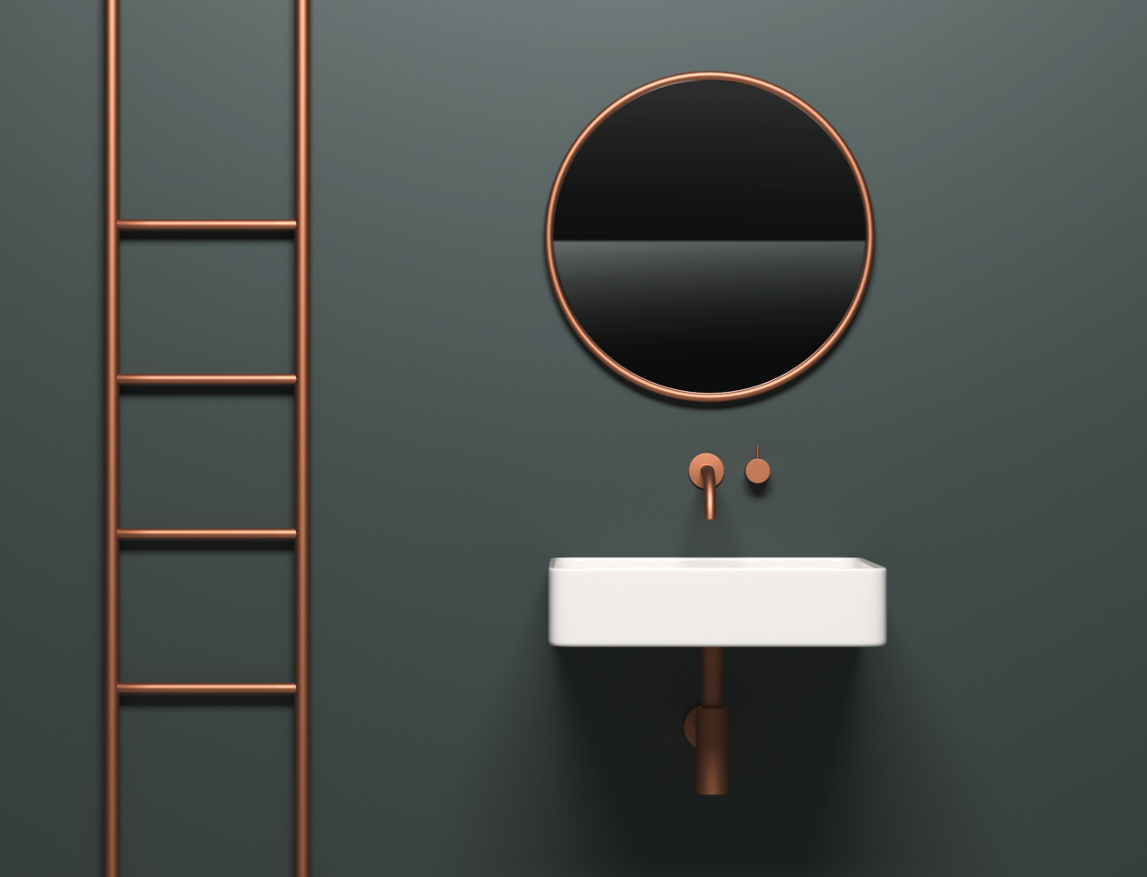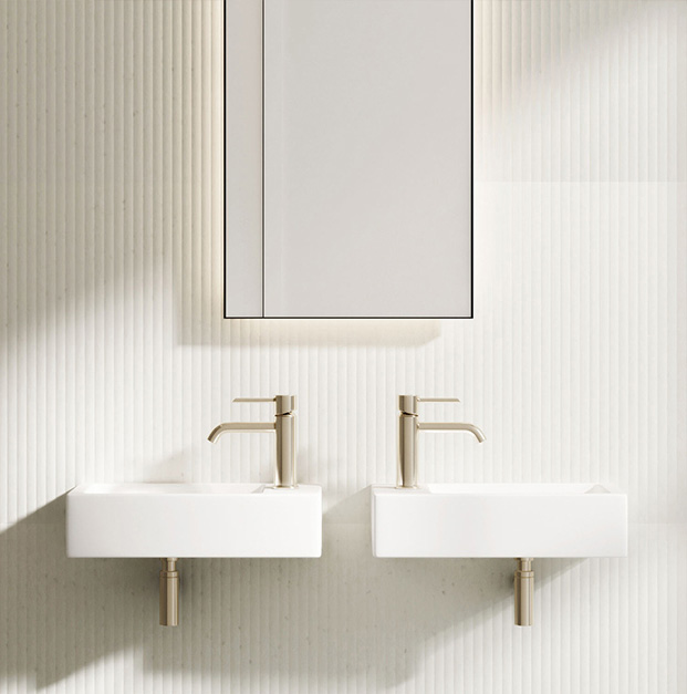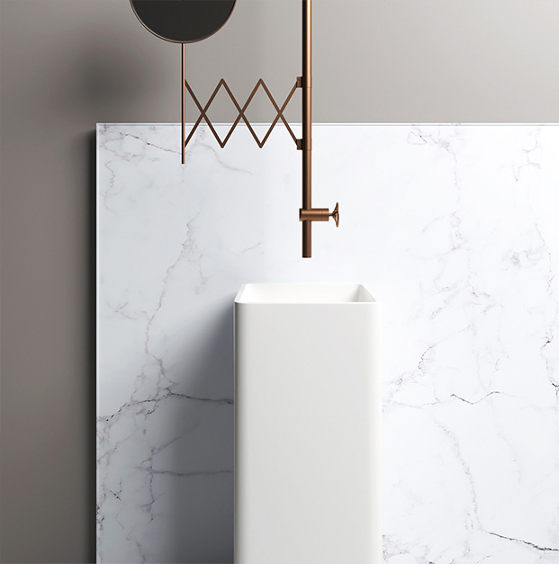
The orange series, the representative color of luster, has its own unique gentleness. Deep or shallow, light or dark, each tone has its own glamorous context, making people intoxicated.

Ultramarine & Amber
Ultramarine is pure, natural, and unvarnished, suitable for a large area decoration, while amber is bright, warm, and gorgeous, creating an unusually vigorous atmosphere with slight embellishment. The bathroom style that combines both is vivid and cozy. The ultramarine tiles on the wall are as transparent as the ocean, and the amber shelving is matched under the vanity mirror. The highlight of the entire space is the amber bath towel, perfectly interpreting the generousness of the whole area. when applicated, it is recommended to combine ultramarine and amber with low saturation, which is neither overstated nor blinding. In terms of proportions, ultramarine is given the priority to be the main tone, and amber is the embellishment color.

Meadow Green& Living Coral
Living coral is reminiscent of lively and energetic pictures. The combination of bright coral and meadow green with low saturation achieves color balance and abandons the flamboyance and frivolity of the secularity, conveying the superiority of color fit. The coral tone highlights the vitality and energy of the bathroom space with a deep hue. The meadow green deduces a pure story with a tender temperament. In the black and white bathroom space, filled with geometric color blocks composed of meadow green and living coral, the bathroom can be bright and downy.


